Why Branding Isn't Just About Logos — And Why Red Means More Than You Think
- Marketer4U.
- Mar 18, 2025
- 4 min read
Updated: Mar 20, 2025
If you look closely at some of the biggest brands in fast food, you’ll notice something interesting — red is everywhere.Think about it: McDonald’s, KFC, Pizza Hut, Wendy’s, Five Guys, Burger King — all use red prominently in their logos and store designs. And it’s not by accident.


Red, according to psychologists and branding experts, triggers excitement, appetite, and urgency. It’s a colour that makes people stop and pay attention — literally like a stop sign! Studies (including research by psychologist Karen Haller, a specialist in applied colour psychology) show that red increases heart rates and creates a sense of hunger and stimulation. Perfect for fast food, right?
But here’s the kicker — these brands were created in a different era, when grabbing attention was the name of the game. Changing these iconic brands now would be commercial suicide — I mean, could you imagine KFC in blue? Or McDonald’s without its golden arches and red backdrop?
Yet, modern brands are steering away from this approach. Take Starbucks, now arguably one of the most powerful food and beverage brands on the planet — and they went with green. A softer, calmer, more natural colour. (If you want proof of Starbucks’ dominance, check out this link https://www.statista.com/topics/1246/starbucks/#topicOverview
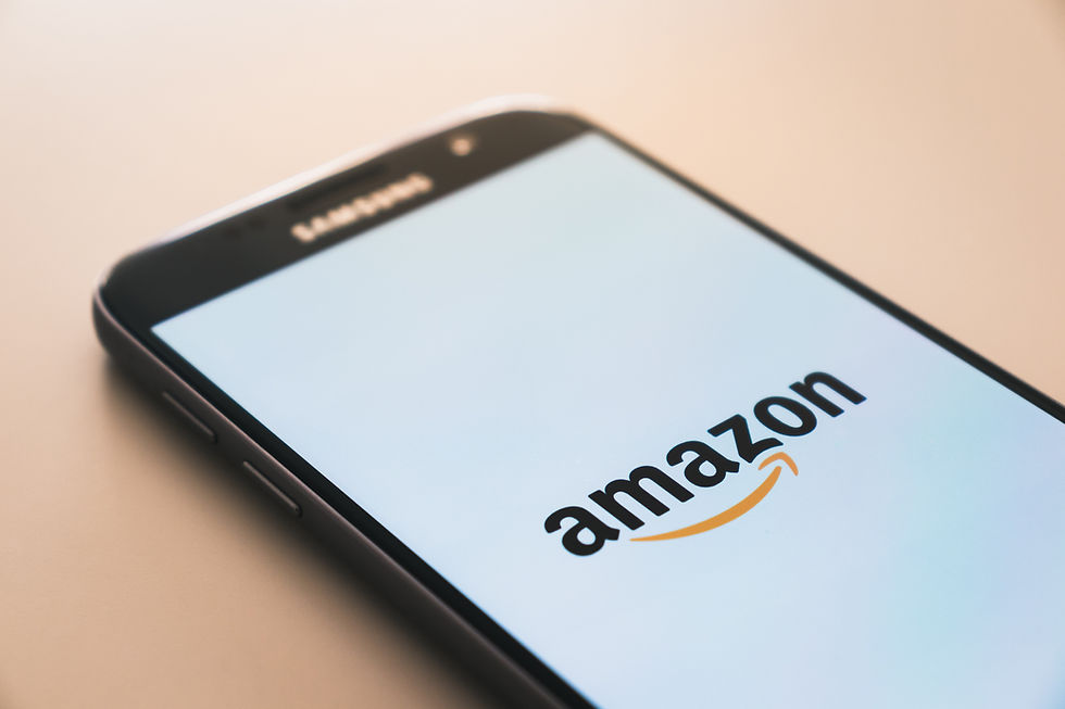
Amazon is another great example. Not a splash of red in sight. Instead, they go with a calm black and orange — and a clever logo that smiles from A to Z (yep, that arrow has meaning). FedEx hides an arrow in its logo too — a nod to speed and precision. Branding these days is subtle, clever, and tied deeply to values and purpose.
Why Colours (and Branding) Are Like Traffic Lights
I like to think of branding as a set of traffic lights.
Red makes people stop.
Green lets people flow past or feel comfortable.
Amber (or yellow) is that cautious space — “Shall I engage? Shall I not?”
Colours give people instant feelings about your business — but branding isn’t just colours.
What I’ve Learned from Working with Brands
Over the years, I’ve worked with many companies that have a great logo and even a solid value proposition, but they’ve forgotten to share their values with their customers. These values are often the foundation of why they exist — but they never tell anyone!
When you blend a strong set of values with a smart logo and consistent branding, that’s when you create something powerful — like Amazon, or like Jeff Bezos starting off selling books and now literally selling everything, with a logo that reflects that journey.
My Personal Branding Realisation
I’ve loved branding and logos for as long as I can remember — I even had the Logo Game as a kid (and yes, I still love playing it!). My favourite brands? Always the simplest ones.
On a recent trip to Switzerland, I noticed how European branding is often simple, bold, and straight to the point — lots of black and white with red and yellow pops. Clean, powerful, and effective.
The Branding Conversation That Changed a Business
Recently, I was working with a CEO on their branding. They were fixated on colours and logos, but I asked them a different set of questions:
What are your goals?
What’s your voice?
What are your values?
How does sales fit into this?
After two hours of digging into the business, I realised something: anyone can design a pretty logo, especially now with AI tools. But if that logo isn’t tied to the values and mission of the company, it’s meaningless — it’ll look good but feel like nothing.
When I finally presented a brand look book two weeks later — which reflected their culture, goals, and values — the CEO finally understood. But then I did something that shocked them...
I told them, "I haven’t finished the job."
Cue confused looks.
What I hadn’t shown them (yet) was what their current customers thought of them.So I reached out to three of their top customers and asked:
Why do you work with this company?
What do you think of their brand?
I also ran their draft brand identity past neutral people (potential customers).
The feedback was gold — honest, clear, and sometimes surprising! The team realized that while they had been so focused on their business plan, they had missed out on customer sentiment, which is huge.
Why Customer Feedback is Part of Branding
Once I presented the final draft — incorporating customer and prospect feedback — the whole team was on board. The CEO saw how aligning internal values with external perception creates a brand that resonates.
The business is now more customer-centric, and that’s always been my favourite part of working on brands — helping businesses realign or even find a new direction based on real feedback.
So Here's My Question to You...
👉 When was the last time you asked your customers how they see you?
👉 Are you still aligned to the business you set out to create?
👉 Have your values shifted, but your brand hasn't caught up?
It’s something I love doing with businesses through M4U — asking why — over and over again until we get to the heart of the brand. Because branding isn't just about pretty colours and shapes — it's about meaning.
So, next time you're thinking about "refreshing" your brand or creating a new one, start with your values, your story, and your customers. Then add the colours and logos.
Because great brands don’t just look good — they feel right.


Comments